<picture> element demo
Responsive images = the browser downloads the “right” image file for the screen size (and display density).

<picture> with media to choose
between lookout_closeup.webp (small screens) and
lookout.webp (large screens).

<picture> with media to choose
between waterfall_1_close.webp (small screens) and
waterfall_1.webp (large screens).
srcset + sizes (resolution switching)
Same photo, exported at multiple widths. The browser chooses the smallest file that still looks sharp.
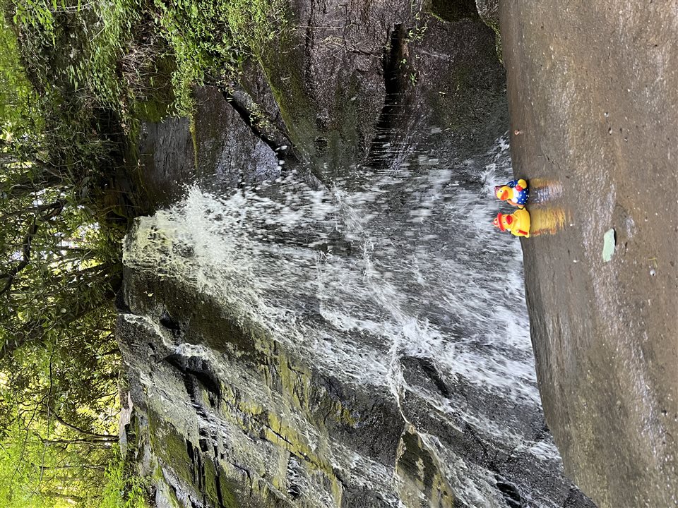
srcset + sizes so the browser can
download a smaller file on phones and a sharper file on larger
screens.